
The Psychology of Colors: Choosing Living Room Rugs for the Right Mood
Have you ever walked into a room and immediately felt calm, energized, or even unexpectedly somber? Often, this is the power of color working its silent magic. When it comes to designing a living space that's not just visually appealing but also emotionally resonant, the choice of a living room rug's color can be a game changer. Let's dive into the vibrant world of color psychology and discover how it can guide us in selecting the perfect living room rugs for our homes.
Understanding Color Psychology
Color psychology is like a secret language, subtly influencing our mood and emotions. Different colors evoke different responses - blues can calm, reds can energize, and greens can refresh. So, when selecting a rug, it's essential to first consider the mood you want to create in your living room. Do you want it to be a tranquil retreat? A vibrant gathering space? Or a cozy, warm den? The color of your rug sets this emotional stage.
The Calmness of Blues and Greens
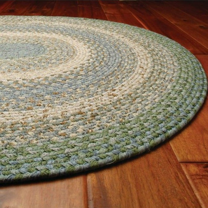
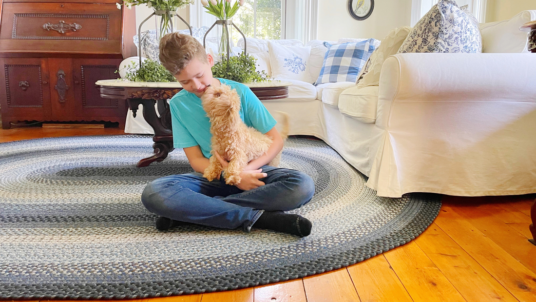
Imagine stepping into your living room after a long day and being greeted by the serene blues or revitalizing greens of a beautiful braided rug. These colors are known for their calming and rejuvenating properties, making them perfect for creating a peaceful oasis in your home. A blue or green braided rug can be a focal point in a minimalist decor or a harmonious element in a more eclectic setting.
Energizing Reds and Oranges

In contrast, if you're looking to create a lively and energetic ambiance, consider a rug in shades of red or orange. These warm colors can stimulate conversation and bring a sense of warmth and excitement to your living space. Imagine a plush, vibrant rug underfoot, invigorating your evening gatherings or family playtime.
Yellows for Happiness and Creativity
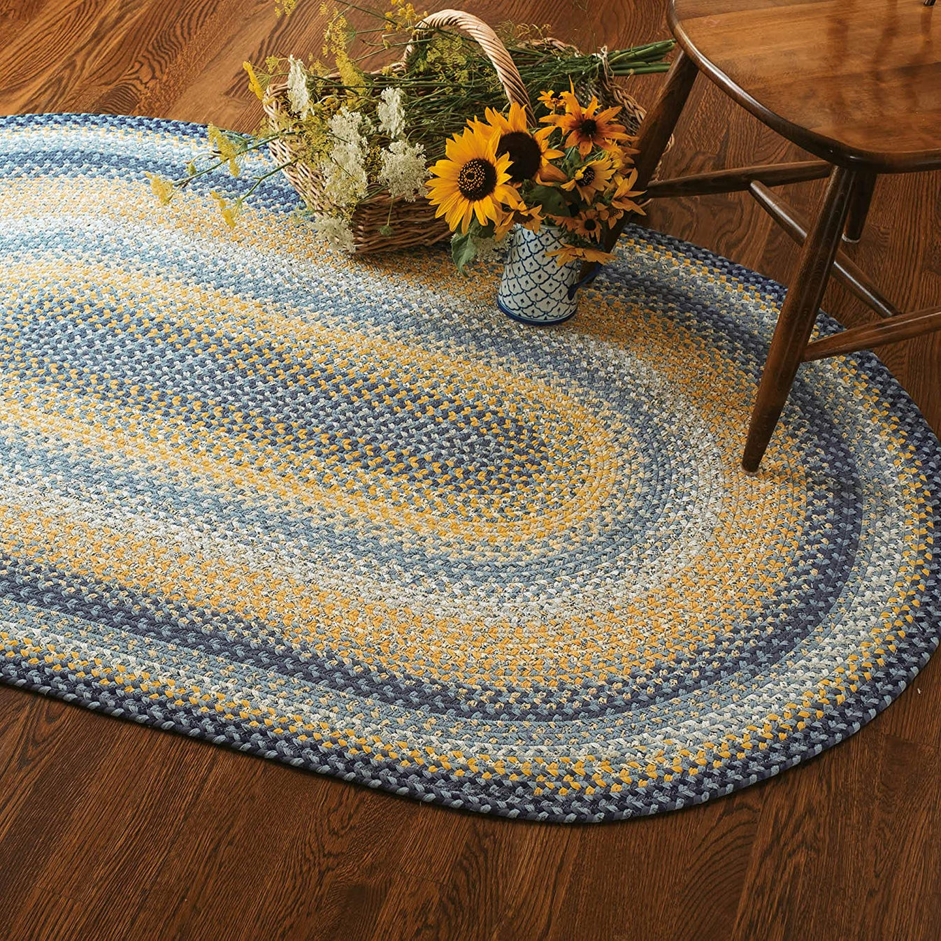
Yellow, the color of sunshine, is associated with happiness, creativity, and warmth. A yellow rug can infuse your living room with cheerfulness, making it a space that stimulates joyous conversations and creative thinking. It's perfect for rooms that need a touch of brightness, especially in homes with limited natural light.
Neutrals for Versatility and Sophistication
Sometimes, you might prefer a color that complements rather than dominates. Neutral colors like beige, gray, or soft pastels provide a sophisticated backdrop that allows other elements of your room to shine. They are incredibly versatile, pairing well with various decor styles and color schemes. A neutral-colored rug can bring balance and elegance, making your living room a welcoming space for everyone.
Conclusion
Selecting the right color for your living room rug is about more than just matching your decor. It's about creating a space that resonates with the desired emotional tone, making your living room not just a room in your house, but a reflection of your inner self. Whether you choose a calming blue, a vibrant red, a cheerful yellow, or a sophisticated neutral, remember that each color has the power to influence the mood and atmosphere of your space.
FAQs
-
How do I choose the right color rug for my living room? Consider the existing color scheme of your room and the mood you want to create. Opt for colors that complement your decor and evoke the desired emotional response.
-
Can a brightly colored rug be too overwhelming in a small space? Not necessarily. A bright rug can be a statement piece in a small space. Balance it with neutral furnishings to avoid overwhelming the room.
-
Are darker colored rugs better for high-traffic areas? Darker colors can be more forgiving in high-traffic areas as they can better conceal dirt and stains.
-
How do I maintain the color vibrancy of my living room rug? Regular cleaning and keeping it out of direct sunlight can help maintain the color vibrancy of your rug.
-
Can I mix and match different colored rugs in an open-plan living space? Absolutely. Mixing and matching rugs can add depth and interest to your space. Just ensure there is a cohesive element, like a similar color palette or style, to tie the space together.